A website is no longer just a nice-to-have for community associations; it’s becoming a legal requirement. In Florida, the importance of a well-maintained HOA or condo website is so clear that the state has passed a law making it mandatory — read more about the Florida Condo Website Law here. As of January 1st, 2026, associations with 25 or more units are required to maintain a website with a residents portal to share key documents with residents, including governing rules, budgets, meeting notices, insurance policies, and contracts.
In this article, we’re going to start by looking at the top 5 condo websites in America to inspire you to create a website for your condominium association. Then, we’re going to look at the advantages of having a website and what you should include in your website.
The Best Condo Websites
The five examples below can help you to create the best condo website for your community.
Riverwoods Plantation
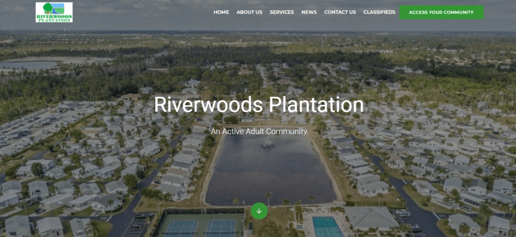
When you arrive on Riverwoods Plantation’s website, you are greeted with a beautiful picture of the association. They describe themselves as an active adult community, and their description shows how seriously they take that! Their pictures are a great example of how you get to know what a community is like just by looking at their photos.
Their website entices prospective members and provides useful information for residents with useful information. They’ve gathered their rules, useful numbers, staff, and board members in one place. As well as all that they’ve got posts on the town and local attractions. Riverwoods Plantation is a great example of a simple, beautiful, modern, and useful website.
How did they build it?
Riverwoods used Neigbrs by Vinteum to build their website, together they made this lovely front-facing website and in access your community, they have a full, secure back-end portal as well.
Their management told us in our customer success story: “90% of our communication goes through Neigbrs by Vinteum”
The platform’s tools allowed Riverwoods to centralize their operations, enhance transparency, and improve resident engagement. Plus, the website is included in all Neigbrs plans at no extra cost, with premium tiers offering a personalized app for added convenience.
If you’d like to create a seamless experience like Riverwoods, explore how Neigbrs can help your community today.

The Copper
The Copper is a beautiful luxury condo in New York, and their website reflects that luxury. It illustrates beautifully the apartments available, the stunning amenities, events that are happening in the buildings and the neighborhood. Showing the neighborhood is a nice touch, as it reassures potential residents that they will be moving to somewhere with good shops and restaurants.
The only downside to this lovely website is that it is sales-focused. That means that there isn’t information for current owners and tenants. It’s good to have documents, forms and a login area for condo members.

AKOYA Condominium
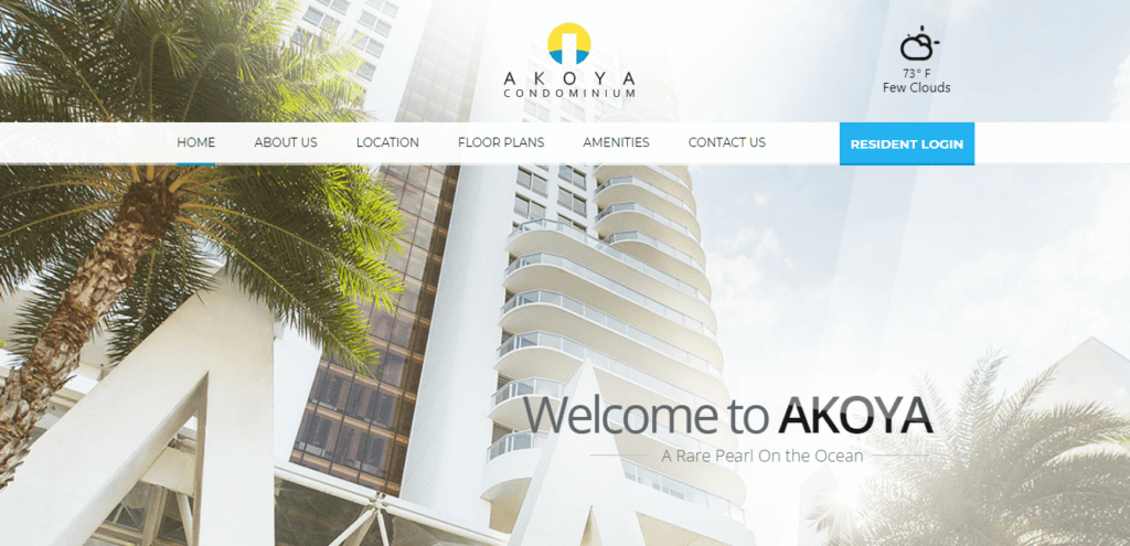
Sunny, stunning, and just a few steps from the hot sand of South Beach. The Akoya Condo Association’s sleek, modern, and functional website offers prospective buyers, and passers-by the opportunity to get a sneak peek into this incredible association. Professional photography accompanies each of the condo’s beautiful amenities.
The website includes things a resident or interested buyer would need to know about the condo, including floor plans, and contact information. It also offers easy access to the resident portal on the backend. The only thing that it lacks is detailed information for its residents. However, its modern look and beautiful photos make it one of the best condo websites.
How did they build it?
AKOYA used Absolute Web Services, an e-commerce agency, to build its website. That means they chose to pay more to have a customized website.
Village at Cordata
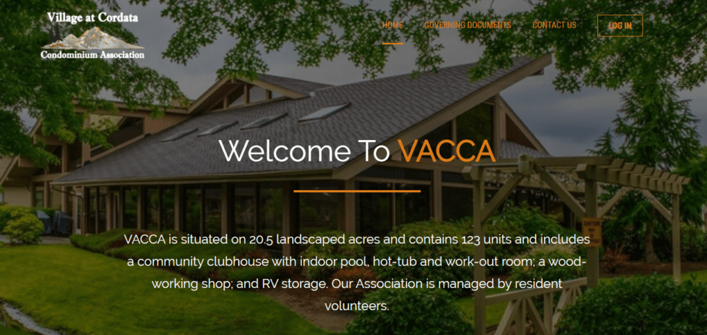
Village at Cordata Condominium Association, or VACCA, has an amazing website. They’re a 55+ community, showing that you don’t have to be a young and hip condo community to have a powerful website.
VACCA makes it onto our list of the best condo websites because it combines usability, great imagery, and incredible functionality for its residents. Residents are able to access governing documents, learn about the condominium committees, research service providers, as well as contact the board all from the website. Anyone browsing gets a real feel for the community spirit and plenty of information on what’s going on in the association. They also made sure it’s mobile-ready to accommodate an active adult lifestyle.
However, their layout isn’t easy to follow. They could include all the buttons in the menu, rather than having them on the page.
Golden Arms
The Golden Arms Condo‘s website is modern, sleek, and unique. Their menu is subtly set to the side, when you open it, it has the different menu items in a large, easy-to-read font and you can access their private member-only portal. They have chosen beautiful photos, by displaying their location they show their privileged location on New Smyrna Beach. They also posted many rental properties to attract new people to the community.
It’s a shame that the text is hard to read against the photo and that there isn’t more information about the community that could be useful for residents.

How did they build it?
Their condo website was built using one of Neigbrs by Vinteum’s templates that were specially designed to improve condominium and HOA web presence.
Advantages of having a website
A website is a Swiss knife, it can be used for many different things. That means that it brings a whole host of benefits to a condo association. It streamlines the tools you use, it is cost-effective, and it works when you don’t. As well as that, it puts your condo’s name out there, boosts credibility and it increases your community’s transparency. It’s an extremely useful resource, whether you’re a small, self-managed condo or a large, managed one. What you can do will depend on your budget, but the benefits are the same.
Streamline your tools
How many different tools do you use to manage your condo association? You might have a resident spreadsheet, a maintenance schedule, timesheets, and a budget planner. As well as that, you may have an email account to stay in touch with owners, and a Zoom account for virtual meetings. Not to mention the paper forms for new residents, to book an amenity, or to register a guest coming to the community. Finally, you won’t have to spend time printing out notices, because you can post them on your website.
Having a single place with all these different tools will save you time and money. It also helps you to be more efficient.
It’s convenient
You can be more efficient since you have a calendar, maintenance requests, documents, and emails at your fingertips with one single website. Rather than messing around with different logins and forms, you can concentrate on one platform to do different tasks.
As well as helping the people in charge of managing the condo, it also helps residents. They won’t have to call or track down a board member or manager anymore. They can go to the website and find the information they were looking for quickly. Being able to do that helps them, and increases satisfaction.
If you add a document with frequently asked questions and necessary forms in one place, it will save you from answering the same questions. And it saves residents the frustration of having to try to find it.
A website is always available
When you’re resting, your website is working for you. It is promoting your condo units for sale and advertising what your community has to offer. This attracts prospective owners and renters when estate agents and property managers are busy or away.
For current residents, it means that they can access a knowledge base about their property and association at any time. So again, they don’t need to call the management office or board members in a panic, because they can access the information they need. Your website communicates with them when you can’t.
It increases your credibility with buyers
Having a website builds your condo association’s credibility. You can create a dialogue about what your community is like, and show pictures. That helps prospective buyers to make an informed decision about visiting a condo. They will know what neighborhood it’s in and what’s offered and have a good impression before they even visit. As well as that, it becomes easier to imagine living somewhere when you have an idea of what it’s like. It will increase their confidence in you if your website is professional and easy to use.
A site increases transparency
When you provide important documents (like budgets, governing documents, rules, and meeting minutes) on your website you’re improving the community’s accountability. This is helpful for residents because it’s very frustrating to feel that you’re being denied access to necessary information. If you have a newsletter, it would be good to post that as that is an excellent source of community news.
It also helps to boost prospective owners’ confidence in you because they have proof that they will be able to access information, rather than having to chase someone down for answers.
What to include on your website?
When creating a website, you should ensure that it has everything that your residents need, for instance:
- Updates: You should have a section where you can let residents know the big updates that are going on.
- Services: Let residents and potential owners know what services the condo offers. Outside the condo, you can use this space to promote local businesses, as well as schools, and local attractions.
- State Law: In Florida, there are laws around what needs to be on your website. The Condo Website Law is an important piece of legislation.
- Documents: Check what documents and questions your residents ask the most and put them online.
- Pictures: Pictures make condo websites stand out, so make sure you do your community justice with some nice photos.
As well as those ideas, you should think about what your community relies on. If you have a lot of events, you may want a calendar so residents can find out what’s going on. If you have amenities, then including a booking system, their opening times, and rules would be important.

How can you build a website?
When looking at how to build your website you have a few options:
| Type | Pros | Cons |
| Use a condo software company | They know the market and have built options thinking of condos You’ll receive all-in-one software with your website They should have good customer support | You’re limited to their options so you need to like what they offer |
| Use templates (eg Wix) | You have a wide range of customizable templates | You have to personalize it yourself |
| Program a website internally | You have complete free range to build the website of your dreams – you are not limited by templates | It takes a long time You or someone else needs to know how to program That person will always have to be in charge of the website |
| Pay a private website-building company | You have a lot of freedom and can tell them what you want | It takes a long time The company has to train you how to use it or look after it themselves It’s expensive |
What about the cost?
How much you spend on your website will depend on the way you decide to build it, but a simple website can cost as little as $40 per year. You can also monetize your website to create a stream of income from it. You can do this by advertising for local businesses, using Google AdSense, and renting out your amenities.
Frequently Asked Questions
What is a condo association website?
A condo association website is a dedicated online platform that serves as the central hub for a condominium community, providing information and tools for both residents and prospective buyers. It typically includes two components: a public-facing site visible to anyone and a password-protected resident portal for accessing sensitive documents such as governing rules, budgets, and meeting minutes. According to Florida Statute 718.111(12)(g), associations are now required to keep records updated within 30 days of creation or receipt on their platform. For most boards, a condo association website replaces a patchwork of spreadsheets, emails, and paper forms with a single, organized system .
Are Florida condo associations legally required to have a website?
Florida condo associations are legally required to have a website under HB 1021, which amended Chapter 718 of the Florida Statutes. As of January 1, 2026, every condominium association with 25 or more units must operate an official website or secure member portal accessible via the internet. Previously, this requirement only applied to associations with 150 or more units, but the 2024 amendment signed by Governor DeSantis dramatically expanded the scope. The site must include a password-protected section inaccessible to the general public and must post governing documents, budgets, financial reports, meeting notices, agendas, 12 months of meeting minutes, active contracts, and structural integrity reports.
What should a condo association website include?
A condo association website should include, at minimum, the community’s name, a contact form, and the most important governing documents. Beyond that baseline, boards should add board member information, community news and updates, amenity details and reservation systems, service provider listings, local attractions, and an FAQ section for residents . For Florida associations subject to HB 1021, the website must also post meeting minutes and video links for all board and member meetings from the past 12 months, uploaded within 30 days of finalization. Including high-quality photos of the community is one of the most impactful things a board can do — they communicate the feel of the community instantly to prospective buyers .
What is a condo association website template, and do I need one?
A condo association website template is a ready-made website layout that your community can customize by adding your own text, images, and documents — without needing to write a single line of code. Templates built specifically for community associations differ from generic website builders because they already include features like amenities reservation forms, password-protected resident portals, and document libraries. For most volunteer boards, a template is the most practical option: it is significantly cheaper than hiring a custom developer, and it can produce a professional, mobile-ready site in a fraction of the time. A simple condo website using a template can cost as little as $30 to $40 per year.
What is the biggest mistake condo associations make with their website?
The biggest mistake condo associations make with their website is building a site that is sales-focused for prospective buyers while neglecting the tools and documents that current residents actually need . A website that does not include a resident portal, governing documents, or a contact form fails to deliver the day-to-day value that justifies its existence. Boards also frequently underestimate the legal obligations: Florida associations that have a public-facing website must ensure it meets all Florida Statute 718 requirements, or they risk non-compliance. Failing to update documents within the required 30-day window is one of the most common compliance gaps.
How do I choose the best template for my condo association website?
Choosing the best template for your condo association website starts with thinking about your community’s identity and your residents’ needs. If your community skews toward senior residents, for example, you should prioritize a template with large fonts, high contrast colors, and straightforward navigation — features that make the site genuinely usable for your members. Consider whether your community is more image-driven or information-driven, and choose a layout that reflects that balance. Templates offered through HOA and condo management software providers are generally the best fit because they are built around the specific features associations need, such as document portals and maintenance request forms, rather than adapted from generic business templates.
How much does it cost to build a condo association website?
Building a condo association website can cost as little as $30 to $40 per year when using a template through a condo management software provider. Custom-built websites developed by a private agency or e-commerce firm — like the one used by AKOYA Condominium — are significantly more expensive and require ongoing technical support from the agency . A middle-ground option is using a general website builder like Wix, which offers flexibility but requires the board to set up and maintain the site independently . Most boards find the best value in condo-specific software platforms, because the website is typically bundled with the full management suite — including communication tools, a resident portal, and document storage — at no extra cost .
Can Vinteum help my condo association build a compliant, professional website?
Vinteum’s Neigbrs platform can help your condo association build a compliant, professional website without requiring any technical expertise. Neigbrs offers six different website templates specifically designed for condominium and HOA communities, and the public-facing website is included in all plans at no extra cost . The platform also provides a password-protected resident portal that meets Florida’s HB 1021 requirements for secure document hosting, keeping your association compliant with state law. Associations like Riverwoods Plantation — which routes 90% of all community communication through the platform — use it to centralize operations, improve resident engagement, and eliminate the need for disconnected tools .
Wrapping Up: Best Condo Websites
A condo website doesn’t have to be difficult. You can create a modern, user-friendly website quickly. It will save you time, and money, as well as streamline your resources. A website is also convenient, and always accessible and it increases your credibility and transparency. To be useful you need to include some basic information for residents and buyers.
If you need help creating a website for your condominium, Neigbrs by Vinteum can help! We have six different website templates so you can make your website reflect your community’s personality. As well as a website, we offer a portal that’s packed full of features to help you communicate and manage your condo association more effectively.


