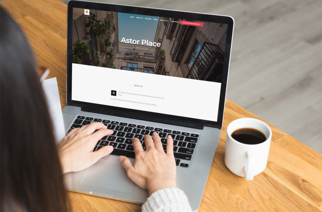
It isn’t hard to create a successful community association website. You need a few key pieces to make it easy to use, and full of useful information. If your site is both easy to use and has useful information, then residents will keep coming back to it.
How to Make Your Community Association Website Easy to Use
A website that is easy to use is key for people to want to use it to find information. If it’s confusing, people will give up on it.
Choose a Clear Template
The simplest way to make a website is to use website templates. They allow you to choose a pre-formatted template and add your own images and text. It means that you don’t have to worry about hiring someone to build and maintain your website for you.
Your website template should be simple to follow, you don’t want to confuse users. Choose one with clear sections, spaces for events, news, services, classifieds and a contact form.
Have an Easy to Read Menu
A great way to make your website easy to understand is to have a clear menu. That way your HOA members and potential members can easily find their way around. So if you have a menu item called ‘News’, it should go to a section that has news in it. This ensures that your site is easy to navigate.
When you choose your menu, make sure that there is enough contrast between the background and the text so that it’s easy to read. The text should also be large enough for older residents to read it without difficulty.
Organize Your Community Association Website
Imagine walking into someone’s home and having to kick away shoes, kitchen appliances, gardening tools, and a few pets. Why would you want to take another step to see the rest of the space? The same applies to web design and the organization of content. This can be the most challenging task in developing a community website.
Make sure the different sections are well-organized so that it is easy to navigate and find information inside your website.
How to Make Your Community Association Website Useful
After choosing a clear template that is easy to find your way around, you now need useful information. There are three key items here: community news, pictures and documents.
Your Community Association Website Needs Information
Make sure your HOA website consistently posts current, interesting content that is relevant and helpful to homeowners and other association stakeholders. You could use a survey to ask residents what they want on their community association website. Or, you could use your experience to think about what you would want to see. This could include, news, maintenance information, upcoming events and amenity opening times.
Add Pictures to Your Website
Pictures are a wonderful visual aid in condo websites. They help prospective residents understand what that community association is like, and you could include current residents’ photos of the HOA or Condo (with their permission), to foster some community pride. They also help to break up blocks of text, and make your website more enjoyable.
Include Documents
Documents are very important in HOA websites. If you’re a condo in Florida, the Florida Website Law include documents you need to add. If you’re not, consider what documents are necessary for residents to find easily, but that can be available for everyone to find. For instance, it’s not recommended to put financial documents on your website, but you could include the ARC form or the regulations around pets.
Conclusion to Community Association Website
Your website doesn’t need to be complex and dense. It should be easy to read and navigate with organized information and nice pictures. A good community website intices prospective buyers, and informs current residents.
If you’re looking for clear, modern website templates powered by an award-winning communication solution then schedule your free demo of Neigbrs by Vinteum.


