An intuitive HOA website design is essential to ensure residents visit it regularly. It helps those unfamiliar with technology navigate the site easily and find relevant information. With a user-friendly design, you can also gain the trust of prospective buyers and keep them interested.
If you’re wondering how to create a great HOA website, keep reading to find out!
One of the easiest and most effective ways to achieve this is by using a platform designed specifically for community associations.
Neigbrs by Vinteum is an all-in-one solution that allows you to create a beautiful, mobile-friendly, and fully functional HOA website without needing technical knowledge. From sharing documents and events to posting news and updates, it helps streamline communication and boost community engagement.

Why does a good HOA website design matter?
An HOA website gives residents a central location to find information about their community. It’s a great channel where the board can post news, events, documents, and other relevant communication.
HOA websites improve communication and transparency in your association. However, when the site design isn’t user-friendly, residents will have difficulty engaging with it. When this happens, you will end up with the opposite effect. Communication becomes more difficult, and residents will feel frustrated. A non-functional website is a waste of time and money. As well as frustrating residents, it can also be off-putting to prospective buyers. Sites with bad designs make it difficult to find relevant information such as contact details. A potential buyer may give up on your community before they have had the opportunity to get to visit it.
A well-designed website provides a good user experience and helps visitors navigate with ease.
4 Elements to think about when choosing your HOA website design
1. Website Template vs Custom Design
When setting up a website, you can choose to build one from scratch through coding or use a template.
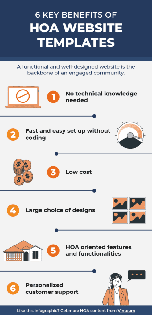
Building one from scratch gives you more flexibility in terms of customization. However, it’s a lengthy and costly process. Companies often choose this option because they have the budget and the expertise. However, website templates are better options for not-for-profit associations. You don’t need technical knowledge to set up your site and don’t have to invest much money. You can customize templates to some extent. You can, for example, choose the colors, logo, and sections name. However, website templates can limit you if you want a very specific layout.
For community associations HOA website templates are an amazing option.
An HOA website template is a ready-made website layout that anyone on the HOA board can use and update. They often include sections or features designed for HOAs, such as amenity reservations, calendars, or resident portals.
2. Accessibility
In the US and other countries, web accessibility is a legal requirement. It consists of making your website usable for any visitors, including people with disabilities. To ensure accessibility, you need to follow some design principles. Most website templates incorporate these principles, but you should check them to ensure.
3. Readability
Visitors should be able to read the text on your site easily. Otherwise, they will leave your page quickly, and it will be hard to get their attention again. Good readability comes with good practices such as:
- Large font
- A distinct contrast between text and background colors
- Text that can be increased by 200%
- Line height (the spacing between two adjacent lines of text)
4. Considering HOA aging residents
Board members often point out that senior residents hardly engage with digital platforms such as websites or HOA management software. This often happens because their platforms aren’t senior-friendly. That’s a good example of a website’s lack of accessibility. With age, our vision and cognitive abilities can decrease. An HOA website design inclusive of aging residents should apply the principles mentioned above. You can also implement the following tips:
- Instructions on your site should be clear and numbered
- Make sure all your clickable items are large so it’s easy to click on them
- Use breadcrumbs so the user knows where they are and how they can go back
Examples of 6 different HOA website designs
1. Park Lido
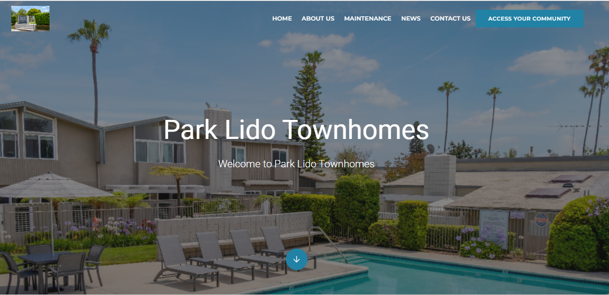
Park Lido Townhomes is an HOA located in Newport Beach, California. Their homepage has a high-quality picture featuring their common areas. It’s the first thing you see when you enter their site; it grabs your attention immediately. This makes it very attractive to potential buyers.
Their “about us” section includes detailed information about their HOA and contact details. The text is written in a large black font with a white background which makes a good contrast.
2. Seachase Condominiums HOA
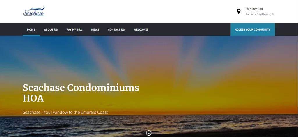
Seachase Condominiums HOA is a community situated in Panama City Beach, Florida. The homepage of their website displays breathtaking beach views during sunset, instantly captivating your attention. Navigating the website is a breeze with its clear menu and organized layout. Additionally, right after the home page, you will find their dedicated news section where they share updates and relevant information. This keeps visitors informed about the latest happenings and events, creating a sense of community and engagement. Alongside the news section, you’ll also find comprehensive information about the property and its amenities, allowing you to make informed decisions about your potential investment or visit.
3. The Avery
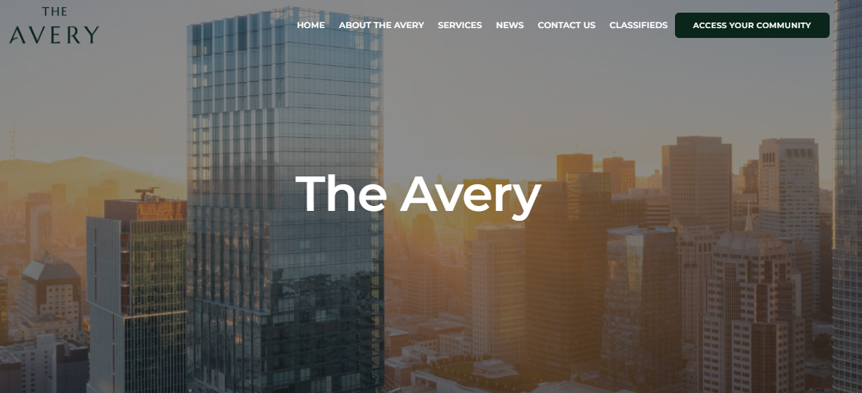
The Avery is a condominium association located in San Fransisco. Their homepage features a breathtaking picture of their 56-story glass tower. The website truly resonates with the condo lifestyle; it’s modern and stylish. You can see that the template only uses black and white shades with a certain formal look. That’s an excellent example of giving a sense of your community through your online page.
Like Park Lido, they have an image gallery that includes high-quality images of their amenities. High-resolution images fit into modern website design as they tell a story about your community.
4. The Golden Arms
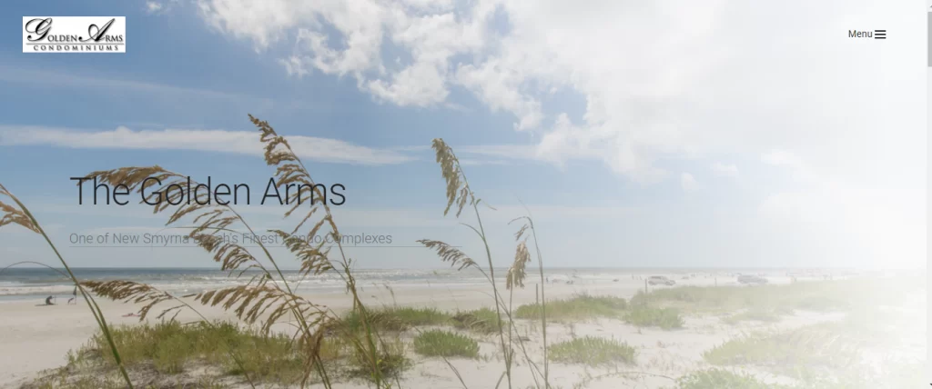
The Golden Arms is a condominium situated in the beautiful coastal town of New Smyrna Beach, Florida. One of the standout features of their homepage is the breathtaking beach view that residents get to enjoy. Potential buyers and renters will be in awe of this captivating sight. The logo on the right catches the eye, and the menu button is also easily accessible. An interesting aspect of the website design is that the different menu categories are hidden, allowing the picture to take center stage and create a sense of spaciousness. The only downside to that is that it may be difficult for non tech-savvy people. One area that could be improved is the color of the title, which could be changed to enhance readability. However, overall, this site is fantastic.
5. Briar Creek Mobile Home Community
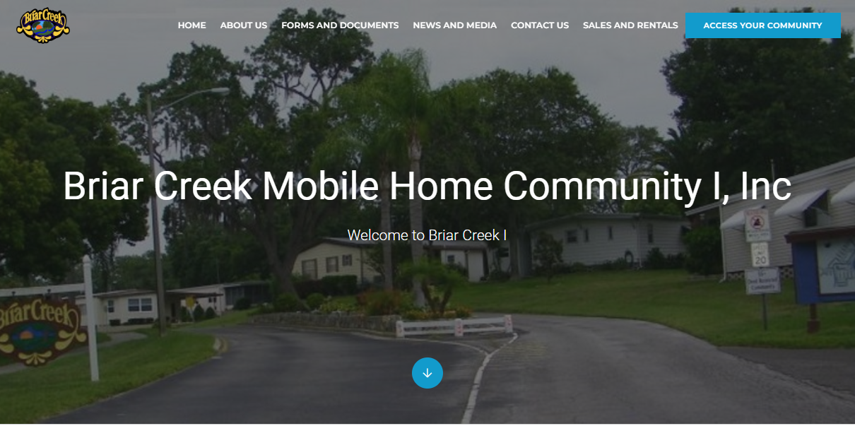
Brian Creek is a home community located in Tampa Bay, Florida. Their HOA website design is similar to the Park Lido one but has few differences. You can see, for example, that they customized the menu bar. You have a link for “Forms and Documents” which is very useful for residents searching for specific HOA Documents.
You also have a link for “Sales and Rentals” which helps potential buyers find the information they need in just one click.
Minor customization such as these can positively affect your site’s user experience.
6. Walker Square Condo
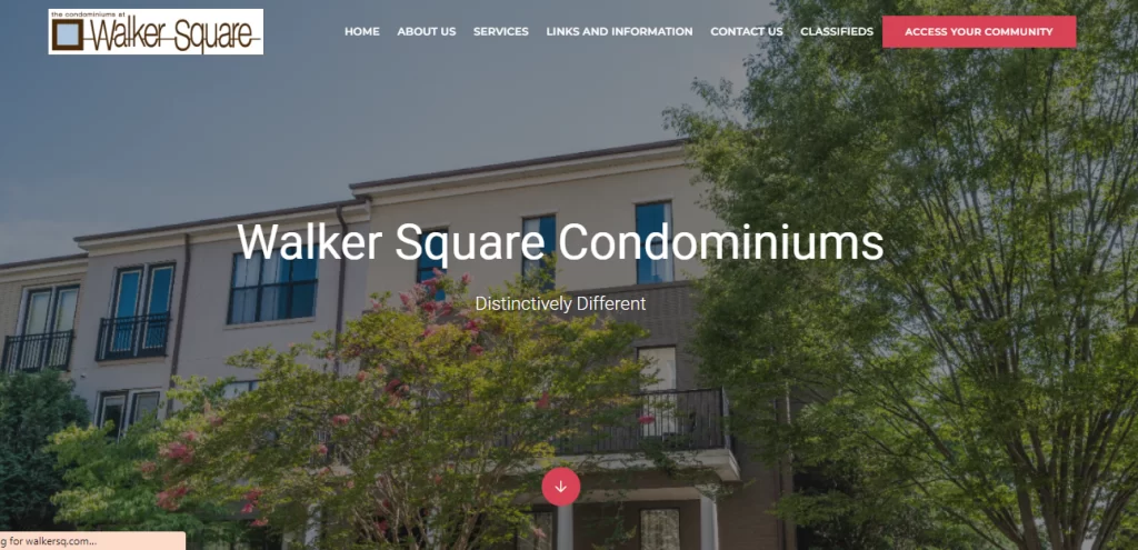
Walker Square Condominiums is located in Charlottesville, Virginia. Their website has a modern, urban, and stylish aesthetic. They use a high-quality image on their homepage which creates a positive impression. It’s simple to find your way around because the buttons at the top are clear and easy to understand. In the middle of the website, you’ll notice the name of the condominium, “Walker Square Condominiums,” along with their catchy tagline, “Distinctively Different.” These elements stand out and grab your attention. They help you remember the name and give you a sense that Walker Square is unique and special. It makes you curious to explore more about what sets Walker Square apart from other places. This is great to attract potential buyers, and be unforgettable.
Final points on HOA website Design
A functional and well-designed website is the backbone of an engaged community. It improves communication, transparency and fosters residents’ engagement. An HOA website template will help ensure that your page applies all the design principles mentioned above. It will also save you time and money.
There’s so much to know about HOA websites. If you’re considering creating one but don’t know where to start, this is the e-book for you.
Download this free e-book to learn everything you need to know about HOA and Condo websites!


