A website is absolutely necessary for any business, and condos and HOAs are no exception. Yet when you browse condo and HOA community websites, as we often do, a lot of homeowners associations have terrible websites. So creating a great HOA website makes you stand out. These days there are lots of different websites that have templates to help you make your own website that Google will like and place high in their search results.
There are several different things that make a great community website. You need a good layout, some essential information, beautiful photos, and everything needs to be relevant. Don’t include something just because you like it, but because it provides value to your target audience. Your website needs to be the best it can possibly be so that they can enjoy it, and by extension love your community.

What makes a good community website?
Google has several ways to decide whether they like websites. While their full algorithm is a secret we do know that they like site speed, high-quality content, and ease of use.
Speed
This means that your community website needs to load quickly, 40% of users will click off a website if it doesn’t load in 3 seconds. That’s nothing! Your community’s website needs to load in less than three seconds, and preferably in less than two seconds.
Content
High-quality content means that what you post is useful and of good quality. For HOAs and condos, this is less relevant because what you post is targeted at residents, potential residents, and possibly potential property management companies. However, you can try by making everything you post easy to read, clear and with information relevant to everyone you’d like to be interested in your site.
Structure
The ease of use is how clear your site structure is. If it’s full of error or redirect pages Google won’t be happy because they like user experience to be easy and enjoyable. So try to make it simple to navigate. For example, when you click on ‘news’ you come to a page that is full of your community’s newsletters, updates about work that’s going on or events that are coming up.
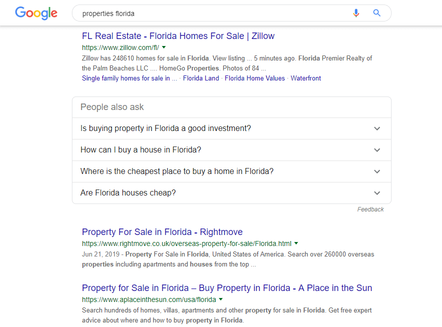
When your site has these things, then Google will rank you well in organic searches. These are searches that don’t have ‘ad’ next to them. You don’t pay to appear in organic searches, you just have all the things mentioned above that make Google happy. In the image below, only Rightmove and Zillow are organic searches, all the results above them are ads.
How to create a good community website?
Where to make a website
There are lots of different tools to create a custom website, they have templates and you edit them to fit what you’d like for your website. You could use Wix, WordPress, Webnode, Squarespace, or our personal favorite, our own solution Neigbrs by Vinteum. Neigbrs by Vinteum includes a beautiful custom community website, and a residents’ portal with a ton of awesome features, we may be biased but it’s a really great service.
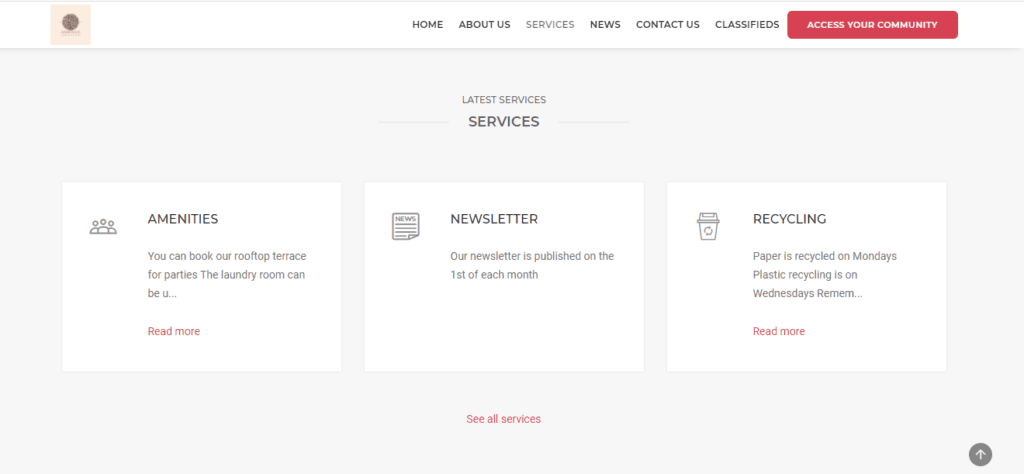
All of these options are based on website templates, so you don’t need to have to code. They also provide step by step instructions on how to create your website. At Vinteum we set up your website software for you and then teach you how to maintain it. You don’t need to know how to code, all you have to do is include the information in the right places, and make sure each heading leads to the correct information. So when someone clicks on ‘pictures’ they get a photo gallery of your community and not information on when the next HOA meeting is.
Design
The whole website should be laid out in a simple format. All text should be black and in Arial, Verdana or Times New Roman on a white background so that it’s easy to read. Don’t have different font colors. And a busy background (for instance a photo of a street) makes it hard to read what’s written on top and it’s distracting. If there’s too much going on your user won’t be able to focus on one thing and they’ll leave your website in frustration.
It can also be a good idea to spend a little bit more to get a custom URL so that people can find you easier. So instead of your site address being examplehoa.vinteumneigbrs.com it could be examplehoa.com, this makes it easier for residents to search for you. Each site charges a different price for this service.
What to include in a good community website?
Images
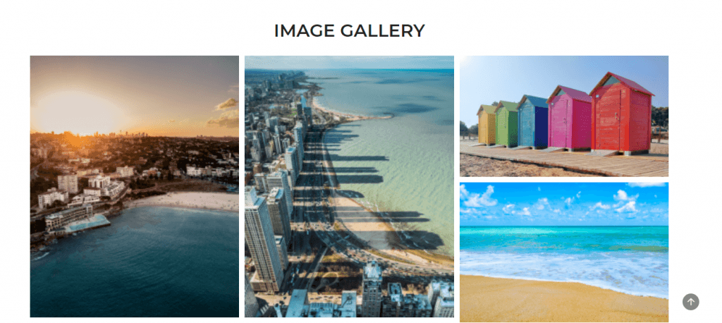
A picture is worth a thousand words, and when you want to show the internet how amazing your association is, it might even be worth more. We recommend putting up loads of high-quality images of all the amazing things your HOA offers, from a green area to a pool or tennis courts. This really gives people a flavor of life in your community. It can be worth paying a photographer or asking an amateur photographer in your community who has a good camera to go around and take some beautiful pictures.
Services
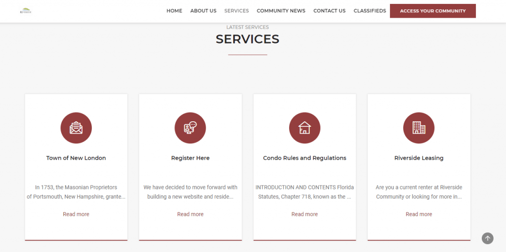
We also suggest including any services your association provides. Do you have an onsite office? Or a phone number people can call 24/7? Do you offer a move in/move out service? What about a basketball court or a play area? Advertise it! It could be the thing that persuades someone to look at a home in your community rather than somewhere else. These little (or big) things make all the difference to life in an HOA or condo.
News
The other thing that your association has to have is news so your residents can see what’s going on. If you have a newsletter, post them so that residents and potential residents can see what goes on in your HOA. Any events you’ve had are nice to post in this section, along with any repairs or improvements that are happening. These things show that your community is inclusive, and makes an effort to let their residents know what’s happening, puts on events, and makes the community better for everyone.
Classifieds
From a business point of view, it would be good to include any homes or apartments for sale in your association on your website. That way potential buyers can admire your beautiful HOA and then see where they could live all in one space. It also helps owners, as they don’t have to do all of the work themselves, they can rely on their community association to help out.
Contact form
Then, if there was a contact form a potential buyer or renter liked what they saw they could send a message directly to a board member, or property manager. Residents could also use it to send any non-urgent messages or questions they might have.
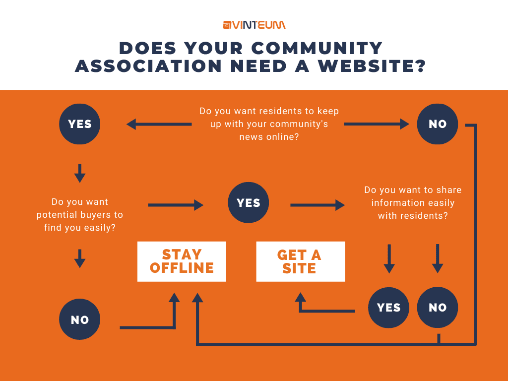
Conclusion to our guide to community website
Your community website should be modern, easy to use, and reflect your community. It needs to persuade potential buyers that it’s a great place to live, it needs to make property managers think that it would be worth managing, and residents should feel proud that they live in such an awesome community with a great website.


